Brand sheet
Everything you need to use KubeBolt well somewhere we don't control: the geometry, the exact colors, the typefaces and what is off limits. The files download straight from here.
01 · The symbol
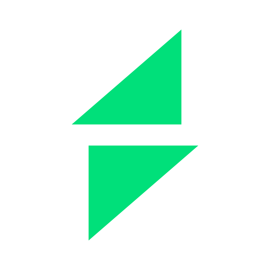
Two congruent wedges, rotated 180 degrees against each other, on a 32 grid.
The mark doesn't draw the bolt — it suggests it, and the eye closes the diagonal. Suggesting outlasts depicting, because a drawn bolt is a stock icon with infinite variants and two cut wedges are a shape of our own.
And the cut carries a reading: desired state and actual state, detect and remediate, human and agent. None of that has to be obvious for the symbol to work, and it never goes in marketing. It is what holds the brand together from the inside, and the answer when someone asks why it's split.
A quarter of the mark's height on all four sides. A 32px mark gets 8px of air. Nothing enters that zone.
The green belongs to the mark and the primary CTA. It is not the color of text, of the wordmark, of borders or of backgrounds. When everything is the accent, nothing is. On paper, #00B864 replaces the accent, where electric green loses contrast.
02 · How it's used
Space Grotesk 600, tracking −0.035em, one weight and one color: #F5F2EC on dark, #1C1917 on light. Never split across two colors or two weights.
KubeBolt always first, always in color, always larger. Kobi is monochrome, smaller and behind the divider. People say "I use KubeBolt" and "I asked Kobi", never the other way round.
Everything below is served from this domain. If you need something that isn't here, write to hello@kubebolt.io.
The KubeBolt AI SRE · visiting
Kobi can be wrong. Official pricing lives in the plans section.