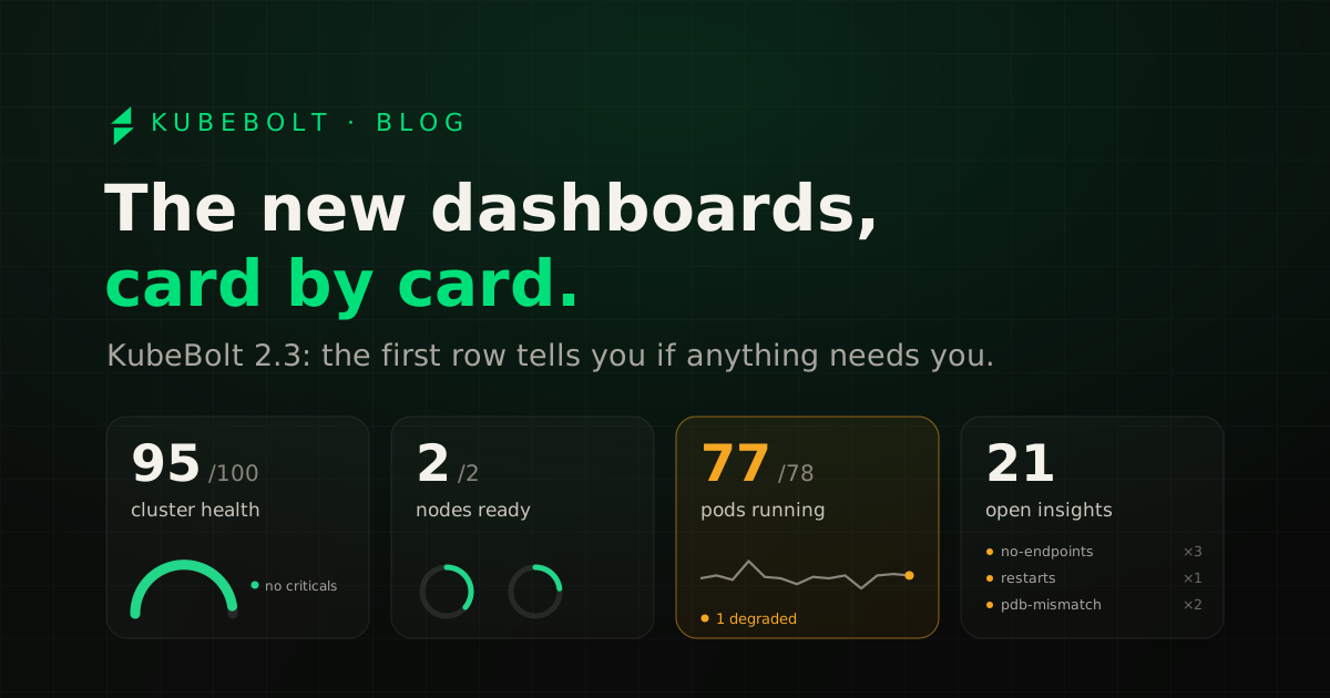
The first thing you do when you open a dashboard is look for anything that needs you. Up to 2.2, Overview’s first row was four rings that looked very much alike, and to find out you had to read all of them.
In 2.3 we redesigned almost every dashboard so that first row tells you as soon as you land. Each card has a large figure with a sentence under it, and a small chart that changes with what it measures. Only the cards showing something that someone needs to check change color.
In this post I go through the cards on Overview, Fleet and Home, which are the ones you’ll use most, and at the end I sum up the rest of the release. If you only want to know what’s in 2.3:
- New dashboards on Overview, Home, Fleet, Capacity, Reliability, Cost, Security, Nodes and Kobi’s usage.
- Autopilot spreads its credit across the month and stops repeating diagnoses it already has.
- Kobi reads node disks, something it had been wrongly refusing since 2.2.0.
- A user with the viewer role can no longer approve Autopilot’s actions.
- KubeBolt installs on OpenShift with no extra steps.
Overview, card by card
Overview is the dashboard for a single cluster, and the one that changed the most.
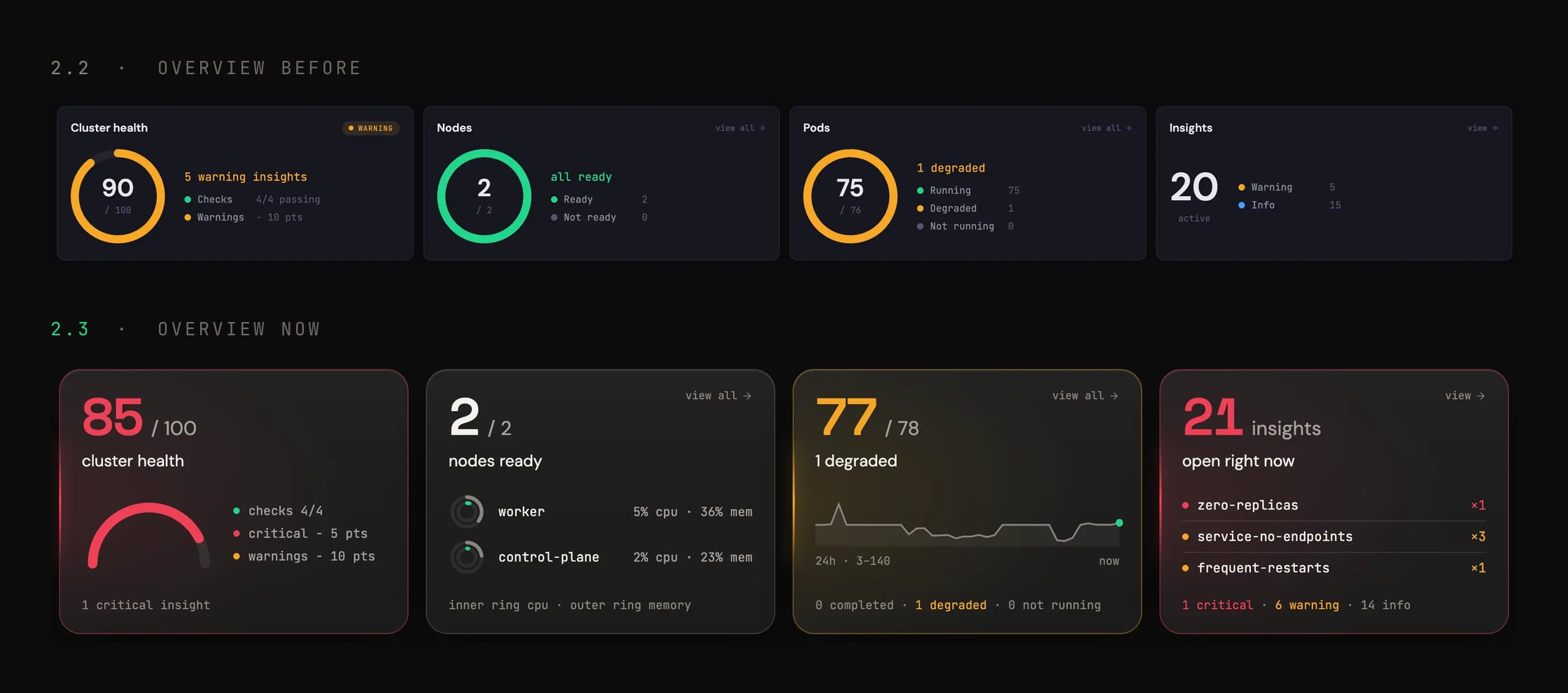
Its first row has four cards:
- Cluster health. A score from 0 to 100 drawn as a half circle. It starts at 100 and takes points off for open insights by severity; next to it you see how many points each group takes off, so you know where the score comes from without opening anything. Underneath, how many critical insights there are.
- Nodes ready. Ready nodes over the total, and the busiest ones as rings: the inner ring is CPU and the outer one is memory. If a node is at its limit, you notice before you read the number.
- Pods. Working pods over the total, with a line showing how many there were over the last 24 hours. A spike or a gap in that line is usually a rollout or a node that went away. Underneath you get the breakdown by status.
- Insights. How many are open right now and a list of the rules that repeat most, like
service-no-endpoints ×3. Underneath, the split by severity.
Each card takes you to its page. “View all” on Nodes and Pods opens the matching list, and the insights card opens Insights.
When a card lights up
A card changes color when its figure needs someone to look at it, for example when there’s an open critical insight or a node that isn’t ready. The others stay gray even when they have data. Red for critical and amber for degraded, the same colors as everywhere else in the product.
| Card | Lights up when… | Where to look next |
|---|---|---|
| Cluster health | at least one critical insight is open | the Insights list, starting with the critical ones |
| Nodes ready | a node isn’t ready | that node and its recent events |
| Pods | some pods are degraded or won’t start | those pods and their last termination (an OOMKilled, a CrashLoopBackOff) |
| Insights | there are critical insights | the insight and its history: whether it happened before, when, and how it was closed |
| Reliability · 5xx | the 5xx error rate goes over the threshold | the affected service and what was deployed just before |
What the table doesn’t tell you is how long things have been that way. That’s what the Pods 24-hour line and each insight’s history are for.
If no card has color, nothing on that dashboard needs you right now.
Fleet: all your clusters in one row
If you have more than one cluster, Fleet is the page you’ll open most.
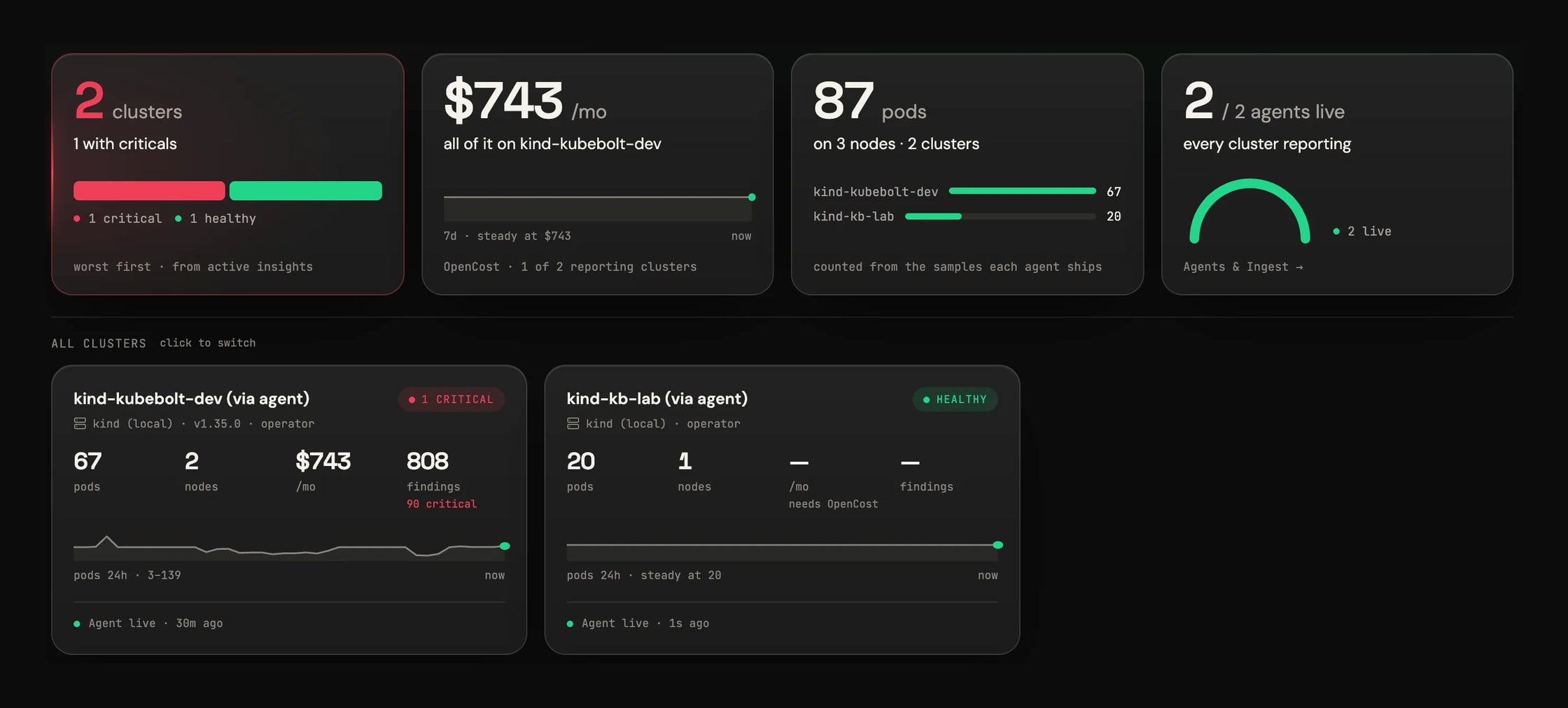
The first row sums up the whole fleet. The clusters card tells you how many you have and how many have something critical, with a bar per cluster sorted worst first. The spend card shows what the fleet costs per month according to OpenCost, the line for the last 7 days, and which cluster it’s concentrated in. The pods card counts how many are running and on how many nodes, split by cluster. And the agents card tells you how many are sending data: if one stops, you see it here before you miss its metrics.
Below that there’s a card per cluster with its status, pods, nodes, spend and security findings, plus its pod line for the last 24 hours. When a cluster is missing a piece of data, the card explains why. In the screenshot, the second cluster shows no spend because it has no OpenCost, and the card says so (“needs OpenCost”) instead of leaving a gap that looks like a zero.
Home: what happened while you were away
Home is what you see when you log in. At the top it tells you how many things need you right now, and just below is “While you were away”, what happened since your last visit.
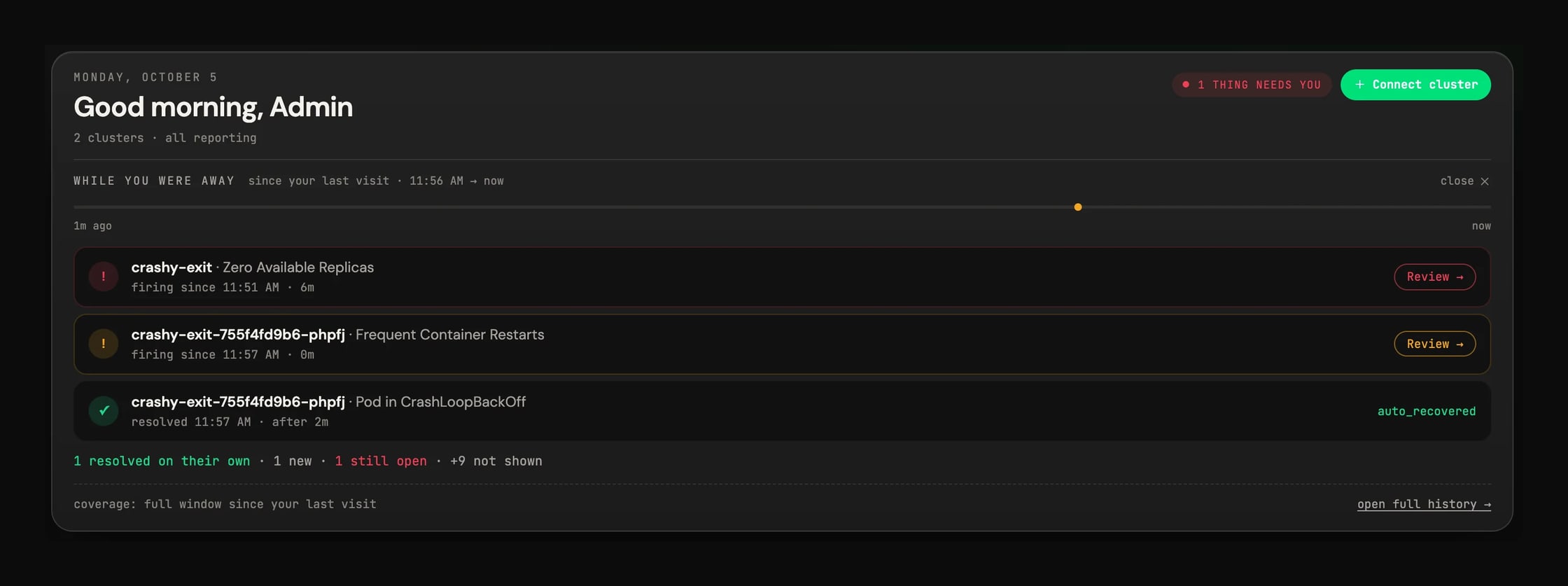
It’s a timeline with up to three episodes, most important first. In the screenshot, one resolved on its own, another is new, and the third is still open, with a button to review it. If there were more, a line tells you how many aren’t shown and takes you to the full history.
Before, this block was a paragraph with one sentence per incident burst. Coming back after a month, you could find fifty sentences in a row. Now you can read it in a few seconds.
Below it, Home repeats the fleet row in a smaller form: clusters, pods, spend and security findings. The spend card also tells you how much of that money pays for capacity nobody uses. In our test environment it was 87%.
The rest of the dashboards
Capacity, Reliability, Cost, Security and Nodes start with the same kind of row. On Cost and Nodes the row goes from five cards to four. Kobi’s usage page, in the AI hub, now opens with sessions, their health, tokens and spend.
There are two details a screenshot can’t show. Figures count up and charts fill in the first time you open a page in a session; if you come back, or the data refreshes, you see the final value straight away, same as with reduced motion turned on. And the colors are now kubebolt.io’s: small text passes AA contrast, which it didn’t before. The light theme is unchanged.
Everything else in 2.3
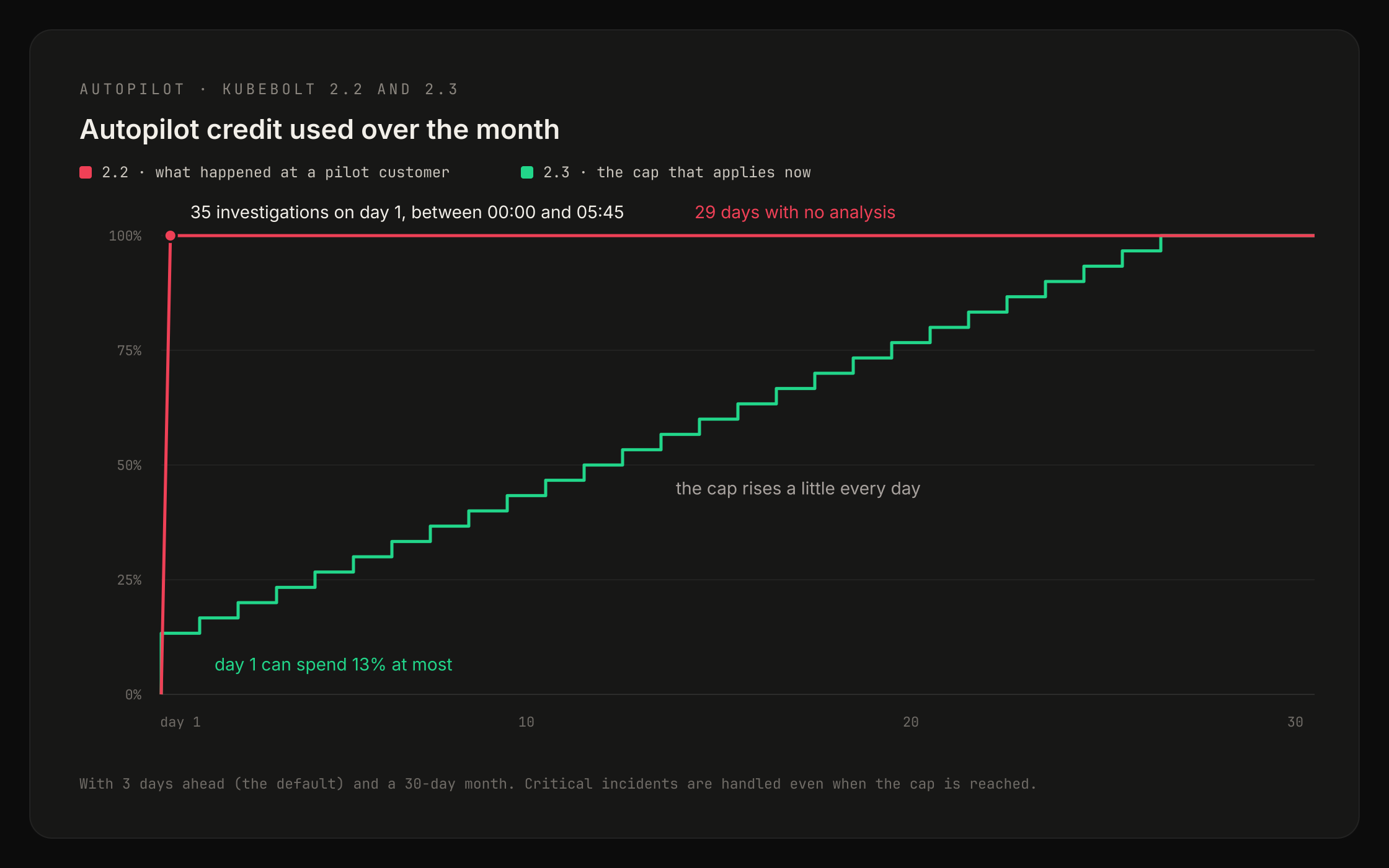
Autopilot. At a customer in our pilot program, Autopilot ran 35 investigations in the early hours of the 1st, almost all on the same two Deployments and with the same result. The month’s credit ran out that night, and for 29 days it couldn’t analyze anything else. Now, if a problem comes back unchanged, Autopilot reopens the incident it already has instead of paying for another investigation, and the credit is spread across the month.
That customer had notification emails turned off, so Autopilot’s recommendations weren’t reaching anyone. Now, if no channel is set up, they’re emailed to the organization’s admins, along with a weekly summary of what’s still pending.
Kobi and disks. Since 2.2.0, if you asked Kobi about a node under DiskPressure, it said it had no access to the disk. The tool was there, but an internal check rejected the query. That’s fixed, and along the way Kobi now checks every disk on the node instead of just the first, and uses the highest value in each interval so a disk that filled up for a few minutes doesn’t go unnoticed.
Permissions. Until this release, a user with the viewer role could change Autopilot’s settings and approve or reject its actions. Now approving and re-running require the editor role, changing settings requires admin, and every decision is logged with the name of the person who made it.
OpenShift. KubeBolt installs with no extra steps, even under the restricted-v2 policy. Thanks to a platform engineer who tested it thoroughly and told us everything that broke.
Insights. readiness-probe-failing and hpa-maxed-out were firing in healthy situations. After upgrading you may see fewer, and the ones left are real.
What’s next
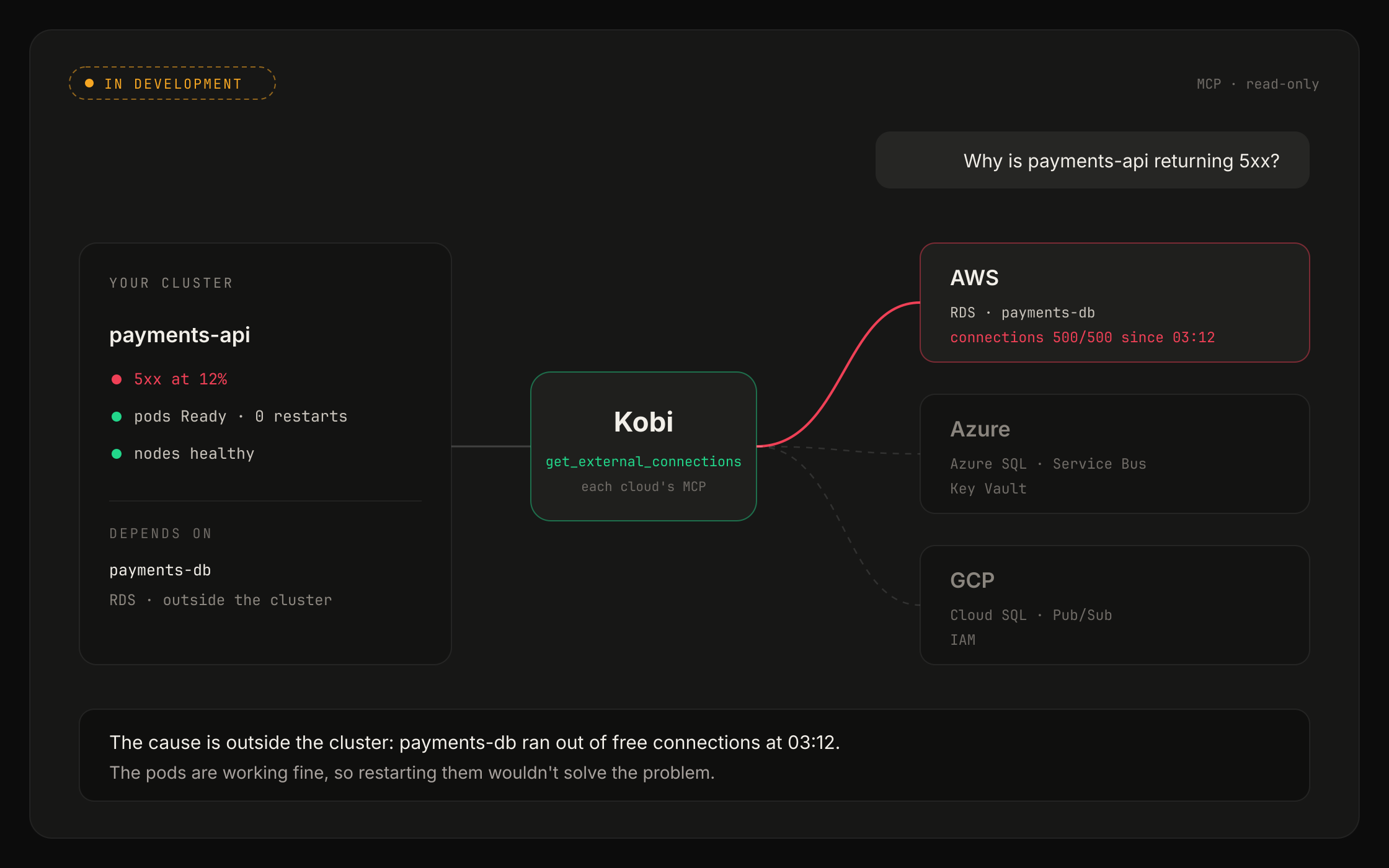
Sometimes the cluster is fine and the problem is somewhere else, like a database that ran out of connections. We’re working on MCP connectors so Kobi can check those resources in AWS, Azure and GCP when it investigates an incident. It will only be able to read: we won’t give it any tool that changes resources in your cloud, and what it sees will depend on the role you create in your account.
Start here
If you’re on Open Source, upgrade to 2.3.0 and the agent to 1.4.2. On Cloud everything is already updated.
Open Overview on your cluster and look at the first row. If any card has color, the table above tells you where to go next.
If you don’t use KubeBolt yet, start free: two clusters, no time limit.