Dashboard: Overview · Capacity · Reliability · Cost
The per-cluster dashboard follows a scan-then-dive rhythm — a summary layer that answers "is anything on fire?", with deep instrumentation below.
Each cluster’s dashboard is organized into sub-tabs built around a scan → dive rhythm: a summary layer up top answers the urgent question at a glance, and the detailed panels below let you drill into anything. Overview and Capacity are always there; Reliability appears when the cluster ships Hubble flow data, and Cost (beta) when it ships OpenCost data. A tab with nothing to show is hidden rather than rendered empty.
| Sub-tab | Question it answers | Needs |
|---|---|---|
| Overview | Is everything fine right now? | Nothing beyond a connection; Metrics Server for live usage |
| Capacity | How is the cluster consuming, and is it sized right? | Metrics history (the agent) for the trend charts |
| Reliability | What is the cluster actually serving? | Agent with Hubble enabled (Cilium) |
| Cost (beta) | What does it cost, and what is idle? | OpenCost data — see Cost |
The card row every tab opens with
Overview, Capacity, Reliability and Cost each open with a row of four cards built the same way: a large figure, one sentence saying what it means right now, a small chart chosen for that metric, and a mono caption with the breakdown and links to the lists behind it.
- A card lights up only when its number needs someone — open criticals, a node down, 5xx over the bar. Its figure turns red (or amber) and the card glows from its left edge. A row where everything is fine has nothing lit, so a lit card is always worth reading.
- A resource you can’t read keeps its slot. If your identity lacks access, the card says No access — insufficient permissions instead of showing a zero.
- The figures count up once. The first time you open a page after signing in (on cluster pages, once per cluster) the figures count up and the charts fill. Coming back, a data refresh, or reduced motion shows the final values.
Overview — is everything fine right now?
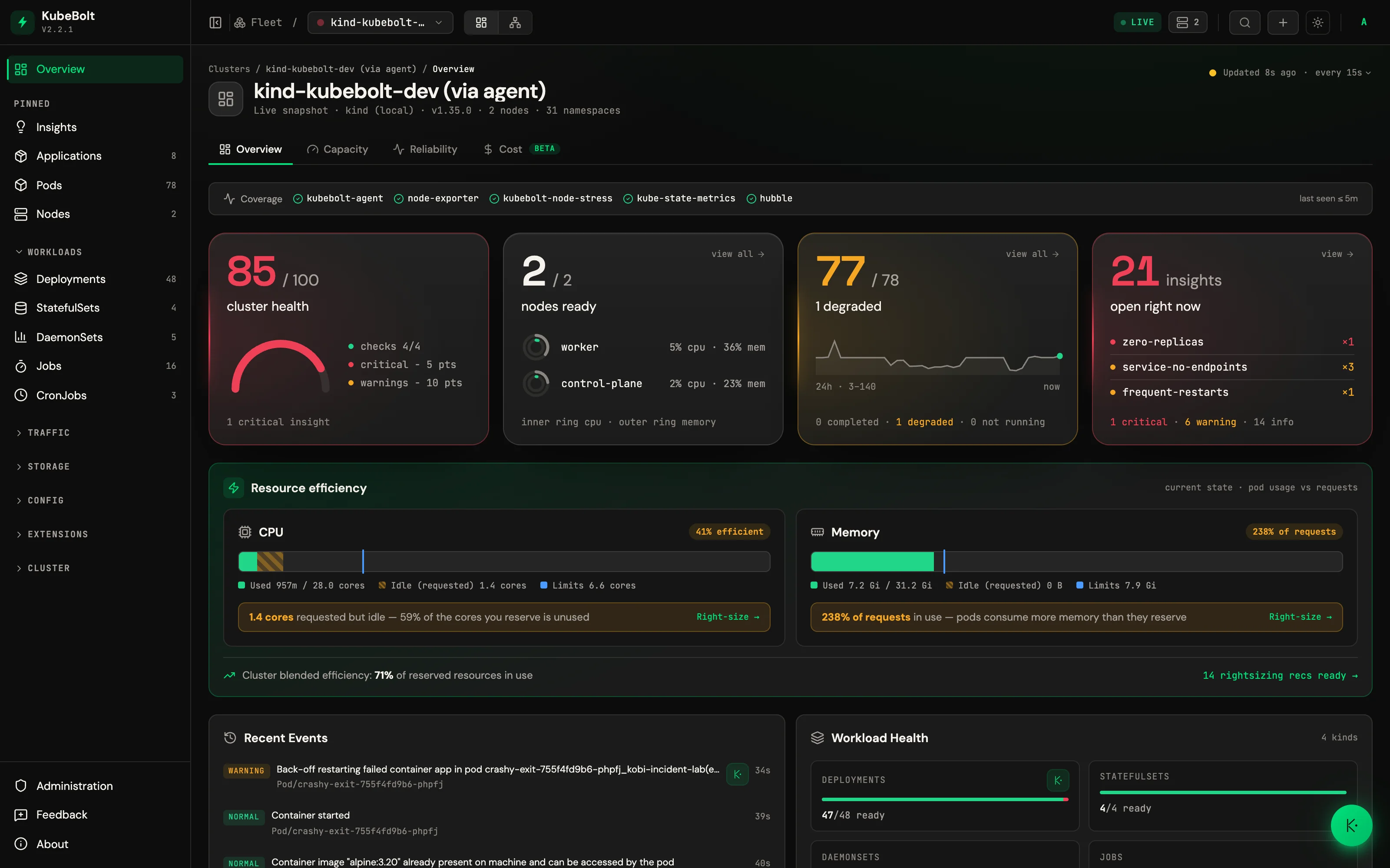
Overview has no range selector: everything on it is current state, and the trends live in Capacity. Its four cards:
| Card | Shows | Lights up |
|---|---|---|
| Cluster health | The score out of 100 on a half gauge. It starts from the component checks and takes off 5 points per open critical insight (at most 25) and 2 per warning (at most 10); the card lists what took points off, and hovering shows every check | Red while a critical insight is open |
| Nodes ready | Ready nodes over the total, and the three busiest (by the higher of CPU and memory) as double rings — CPU inside, memory outside — with “+N more”. Without node metrics, a Ready / Not ready list | Red when a node is not ready |
| Pods | Running pods over the active ones, and the pod count over the last 24 hours as a line (needs the agent; without it, a Running / Degraded list). The caption splits completed · degraded · not running, each linking to its filtered list | Red when pods are not running, amber when they are degraded (Pending, CrashLoopBackOff, partially ready) |
| Insights | Open insights, the three rules with the most of them (worst severity first), and the critical · warning · info split | Red with a critical open, amber with a warning |
Completed Job pods are left out of the pods denominator, so a batch of finished Jobs never reads as missing pods.
Below the cards:
- Resource efficiency band — a capacity axis per resource with three stripes: used, requested-but-idle (striped), and free. The reclaimable gap is drawn explicitly, with per-resource efficiency scores and right-size callouts where there’s something to reclaim.
- Identity header — breadcrumb plus the cluster’s cloud provider and region, detected automatically from node metadata (they simply don’t render when undeterminable — nothing to configure).
- Workload health at a glance, next to a recent events feed where each warning has an Ask Kobi affordance (shown when Kobi Copilot is configured).
- Namespaces as tiles with their workloads and pod readiness.
Capacity — a scan layer over the trends
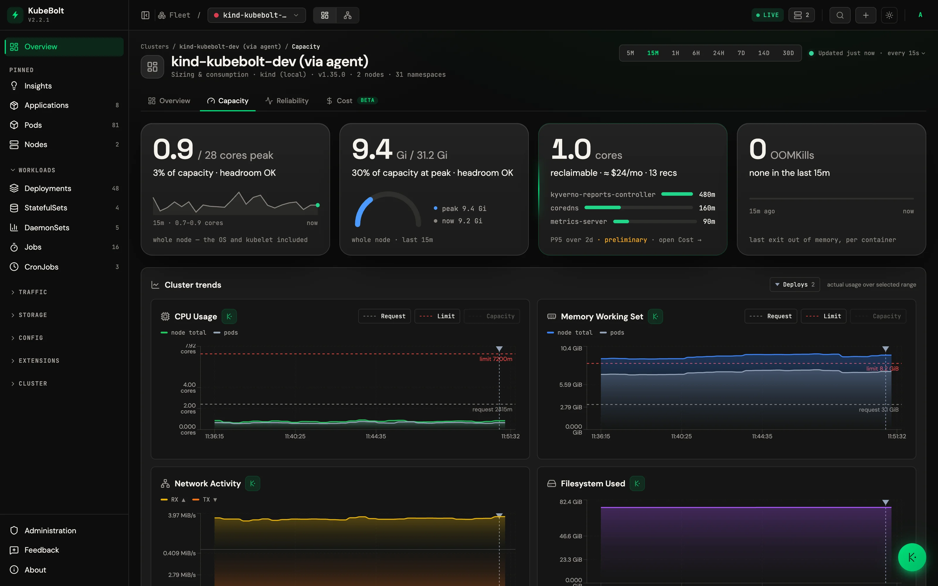
- Card row: Peak CPU (its curve over the range, for the whole node — the OS and kubelet included), Peak memory (how much of capacity the peak took), Rightsizing opportunity (the reclaimable cores or GiB and the workloads that would hand back the most; with OpenCost connected it adds the ≈$/mo that is worth and links to Cost), and OOMKills (when they happened, as marks on the range’s track). The peak cards light amber at 80 % of capacity and red at 90 %; OOMKills lights amber when there are any. The numbers come from the same series and queries the panels below plot.
- Trends — CPU, memory, network and filesystem charts overlaid with deploy markers. They read metrics history, so without the agent this block shows a placeholder instead of charts.
- Top workloads by CPU, with ReplicaSet pods collapsed into their Deployment.
- Recent Deploys and Recent OOMKills as scannable tables. OOMKills are enriched with the container’s memory limit and restart count — you can tell a chronic crash loop from a one-off — and each row has an Ask Kobi affordance to investigate.
- Right-sizing rows show per-item reclaimable CPU and memory. With cost data connected, the Cost tab prices those same recommendations.
Reliability — golden signals, honest colors
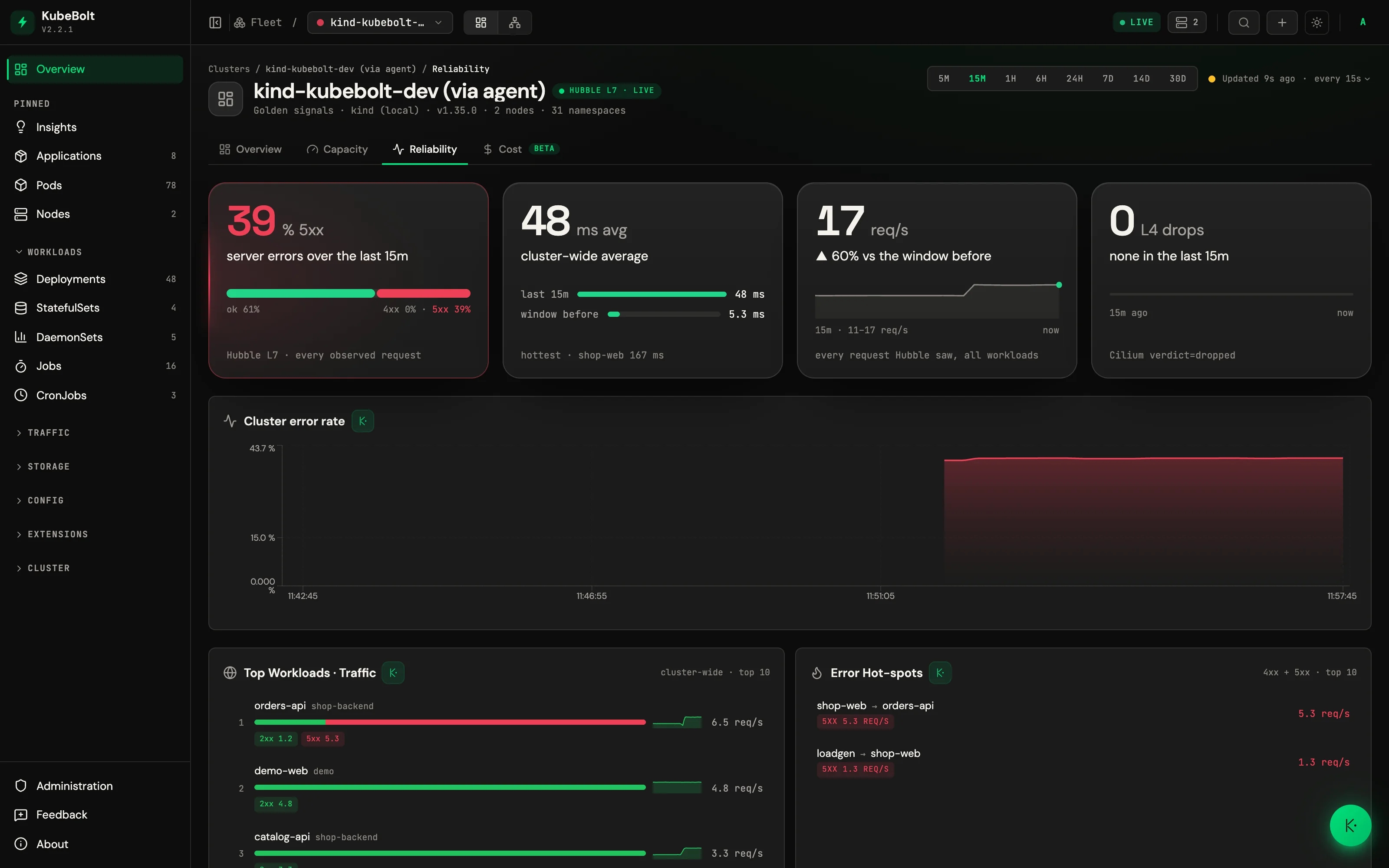
- Card row: Error rate 5xx (the traffic split by status class), Latency (this window against the previous one), Throughput (its curve over the range) and L4 drops (where they land). Comparisons are against the previous window of the same length, not the same time yesterday. The 5xx card lights red from 0.1 % of requests; Latency lights amber when it rose more than 10 %; L4 drops lights amber when there are any.
- Class-pinned colors: 5xx is always red and 4xx always amber, even when one class has no data in range.
- Panels below the cards: error rate split into 4xx and 5xx, top workloads
by traffic, top workloads by latency, error hot-spots (sorted by absolute
error rate, so a small service that always fails isn’t buried) and network
drops (L4
droppedverdicts — the early warning for NetworkPolicy denials). - Latency is labeled as an average — the agent ships sum + count, not histogram buckets — and a tooltip says so instead of letting you assume a p99.
The Reliability tab is powered by Hubble flow data, so it appears only on
agent-connected clusters with Hubble enabled (hubble.enabled=true on the
agent chart). See Connecting clusters.
Shared behavior
The selected time range is shared between Capacity, Reliability and Cost and persists while you drill into resources, but resets to the 15-minute default on a fresh browser session — the daily scan never accidentally fires a 30-day query.
Cost (beta)
Spend, idle cost, cost per pod and money-priced rightsizing, from OpenCost data the agent ships. It is covered on its own page: Cost.